Matt Connors
Body Forth, Jan 27 – Mar 5, 2022
Past: 60 Lispenard St
Installation view, Body Forth, Canada, 2022
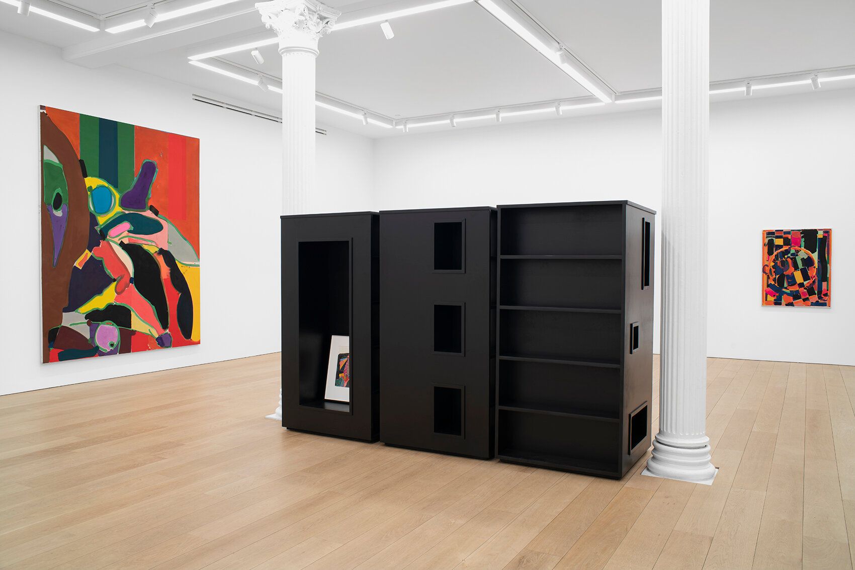
Installation view, Body Forth, Canada, 2022
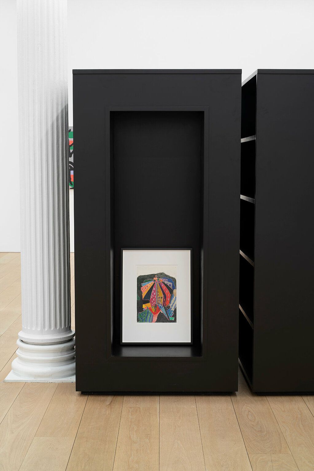
Installation view, Body Forth, Canada, 2022
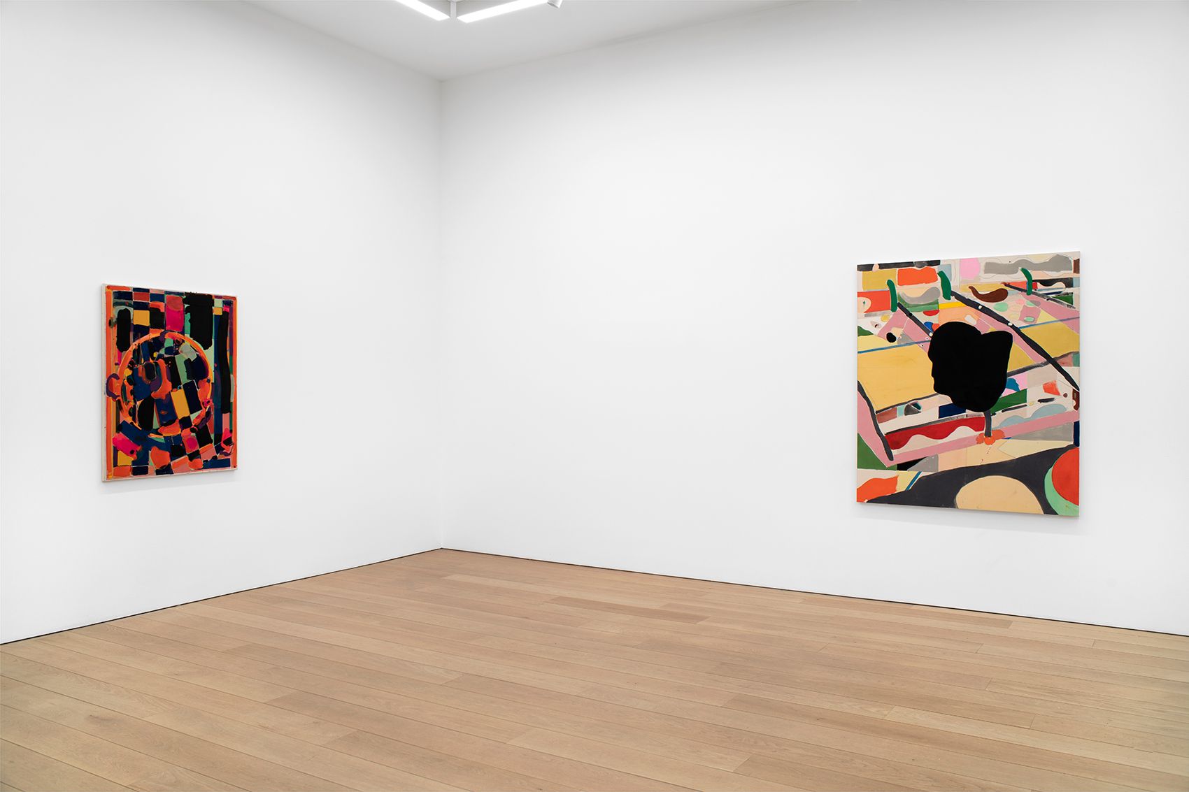
Artworks
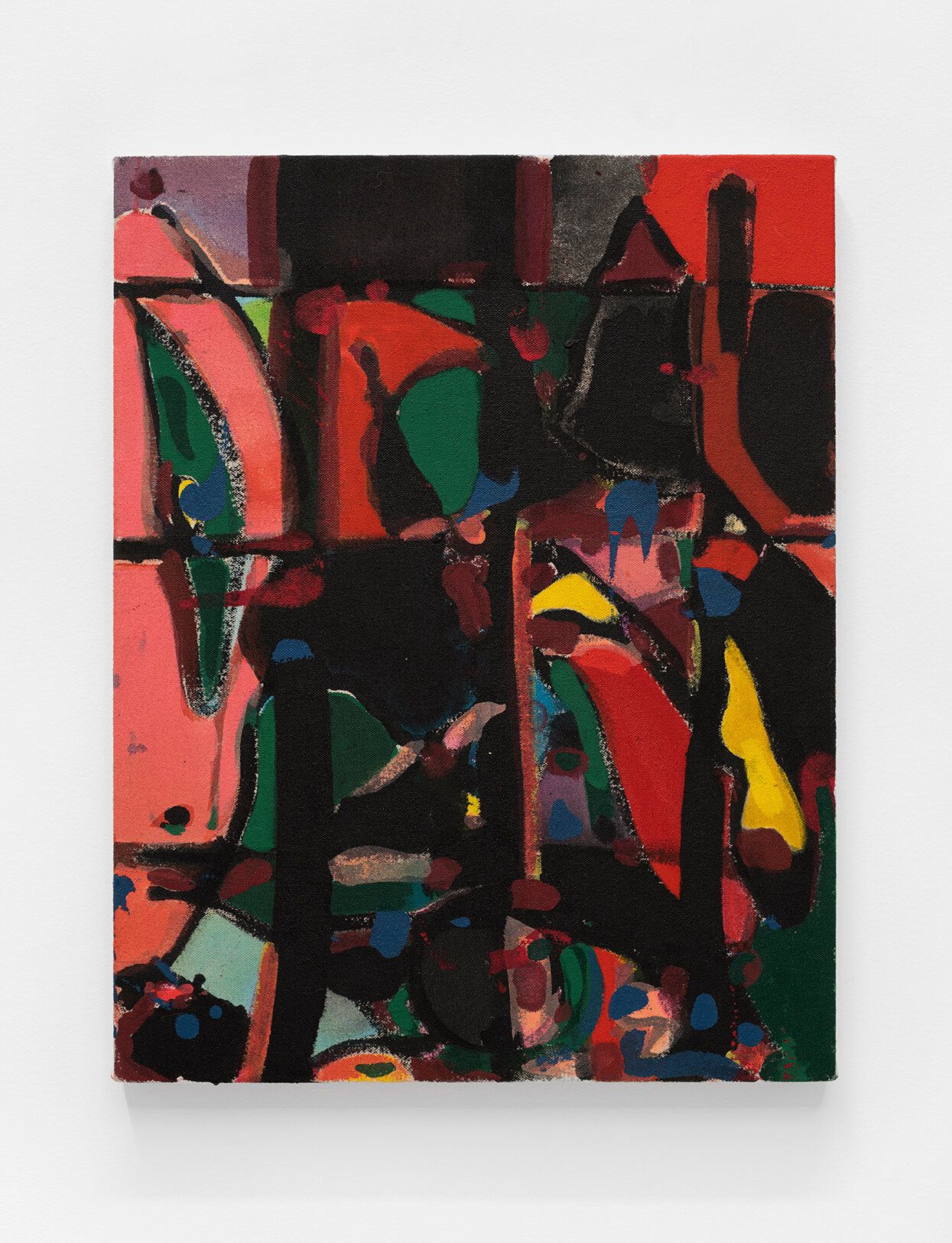
Matt Connors,
Der Hang,
2021,
18 × 14 in (45.72 × 35.56 cm)
Acrylic and oil on canvas
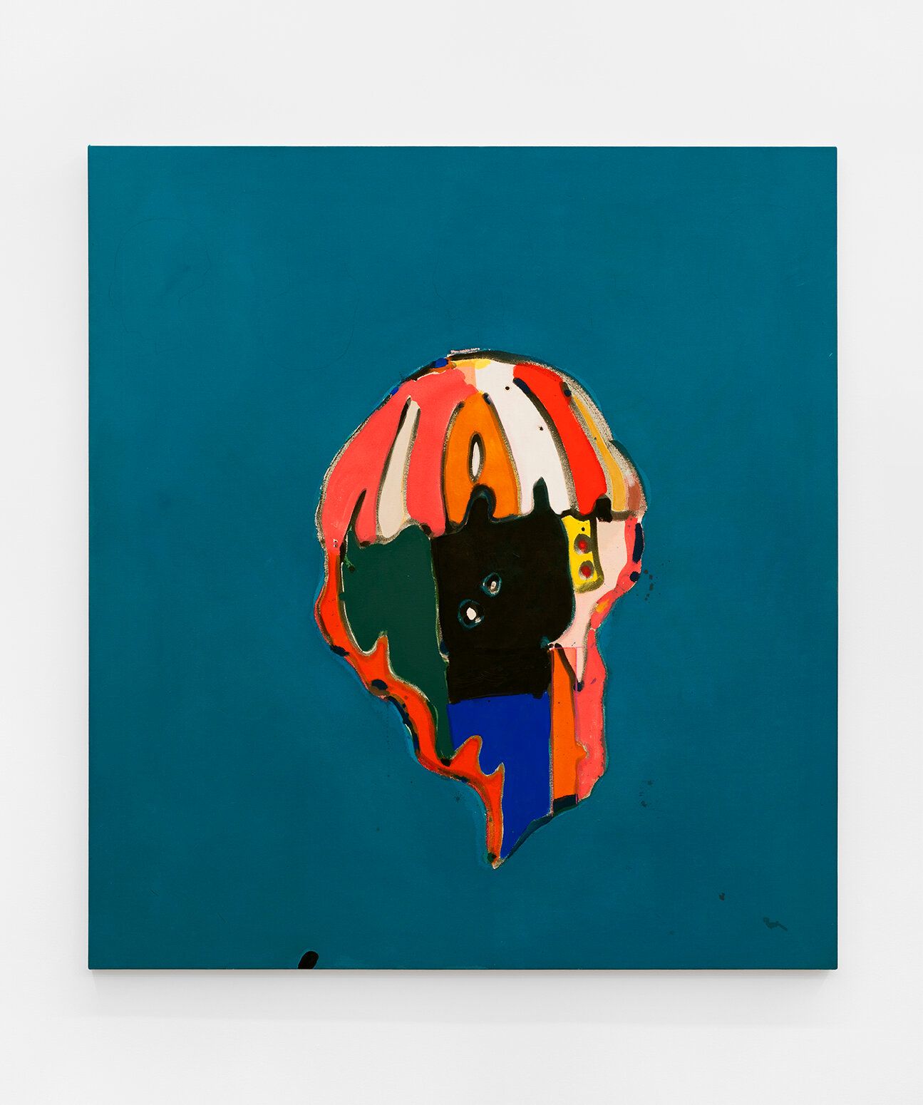
Matt Connors,
Righted Marquise,
2022,
55 × 50 in (139.7 × 127 cm)
Acrylic, oil, and colored pencil on canvas
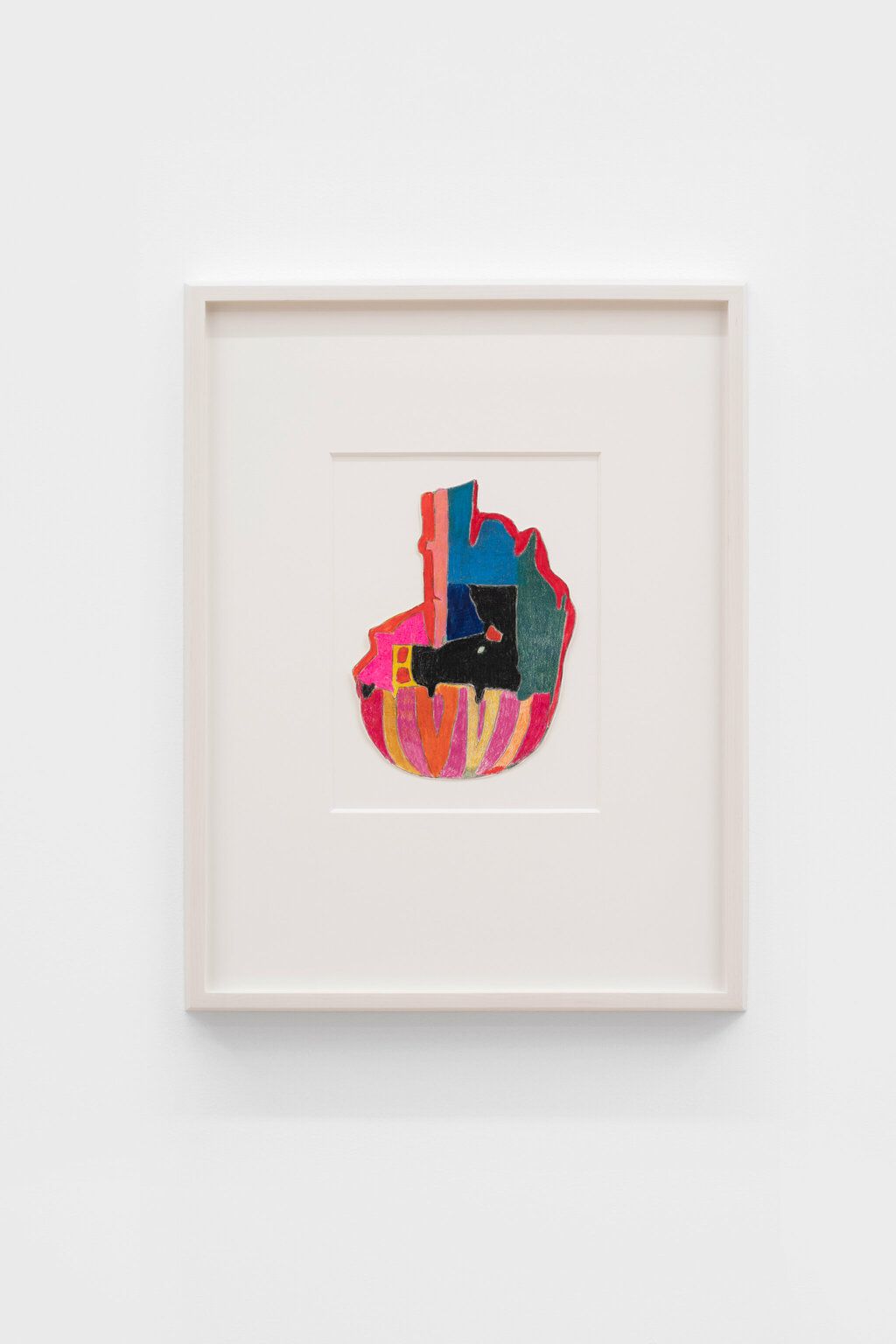
Matt Connors,
Untitled,
2021,
9 × 6 ¾ in (22.86 × 17.145 cm)
Colored pencil on paper
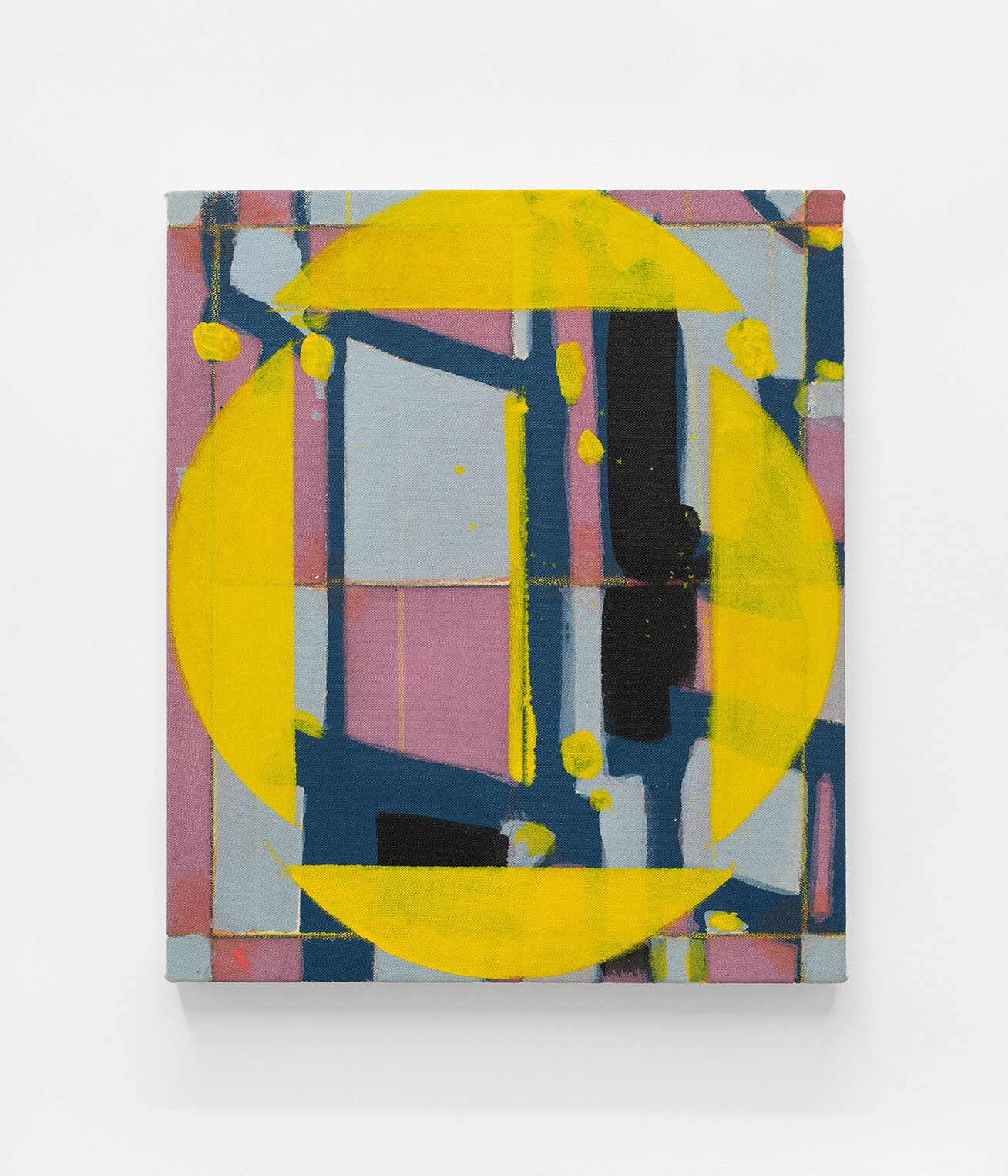
Matt Connors,
execution-er,
2021,
14 × 12 in (35.56 × 30.48 cm)
Acrylic and oil on canvas
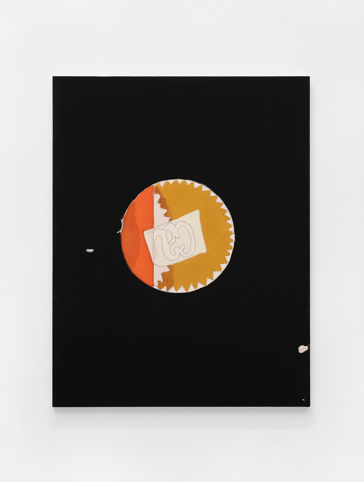
Matt Connors,
does it hurt to see your double,
2021,
36 × 28 in (91.44 × 71.12 cm)
Acrylic and pencil on canvas
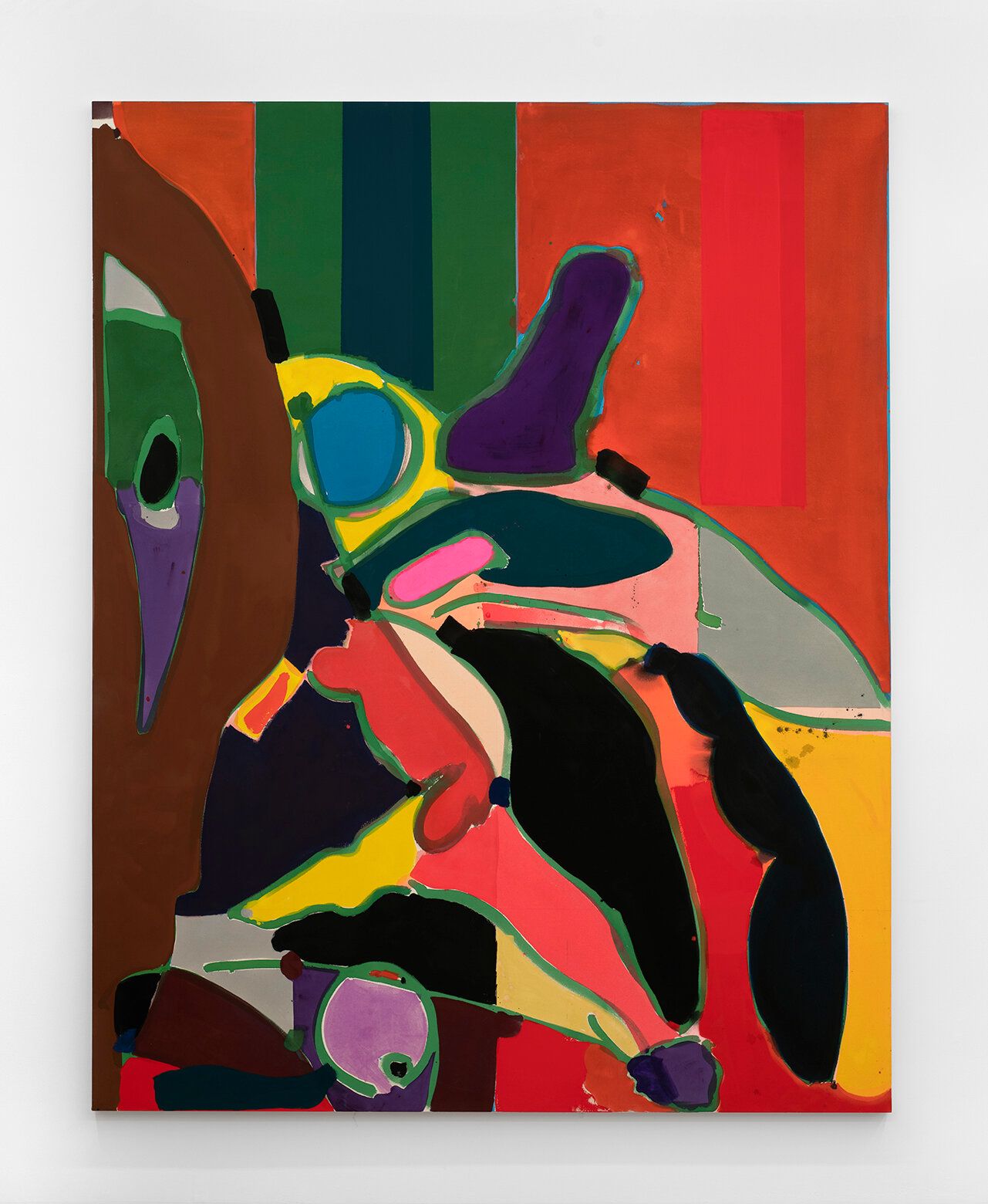
Matt Connors,
Fourth Body,
2022,
115 × 91 in (292.1 × 231.14 cm)
Acrylic on canvas
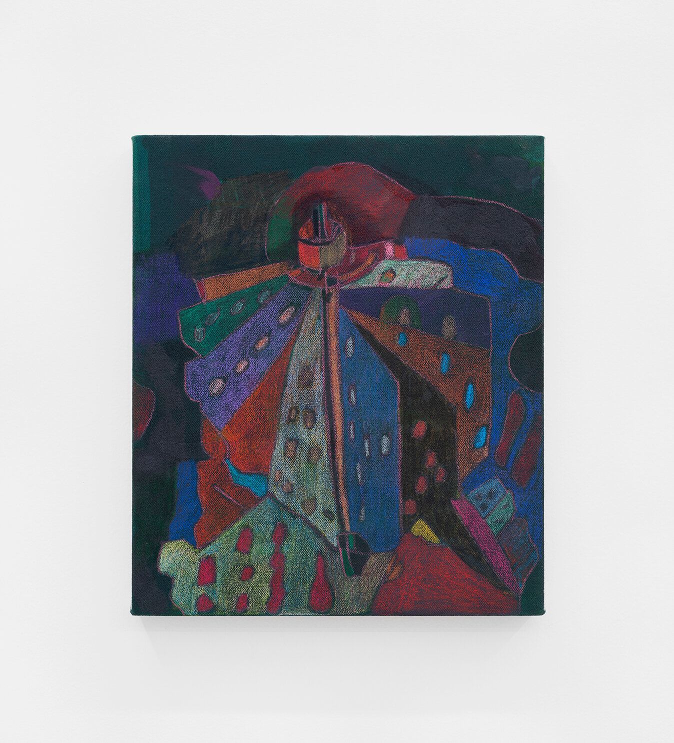
Matt Connors,
Catholic Research,
2022,
14 × 12 in (35.56 × 30.48 cm)
Acrylic and colored pencil on canvas
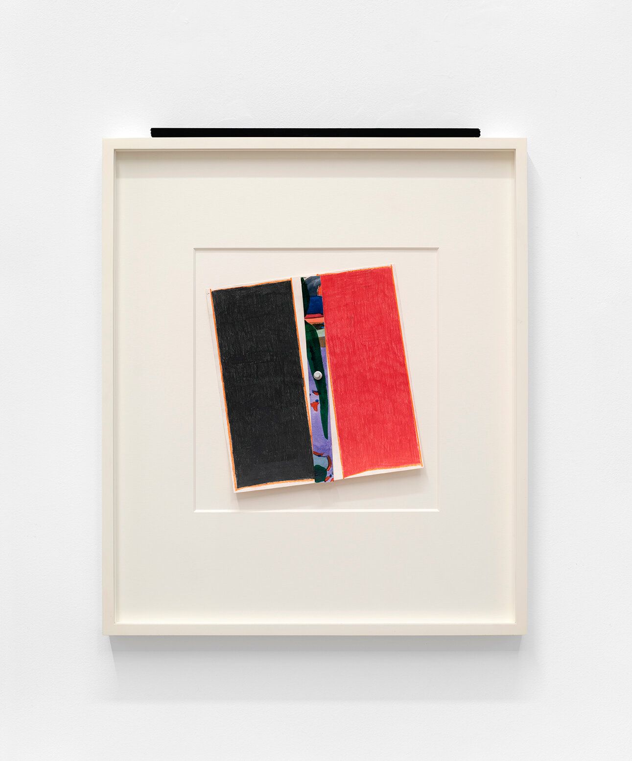
Matt Connors,
You're dead ,
2021,
10 × 10 in (25.4 × 25.4 cm)
Colored pencil, watercolor, push pin on paper, artist's frame
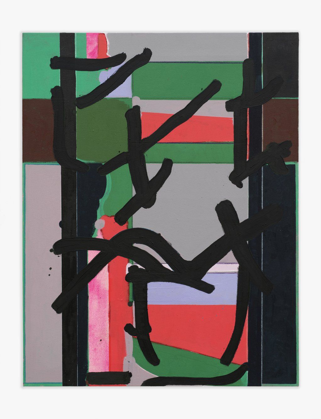
Matt Connors,
Frantic Comedown,
2022,
36 × 28 in (91.44 × 71.12 cm)
Acrylic, oil, and colored pencil on canvas
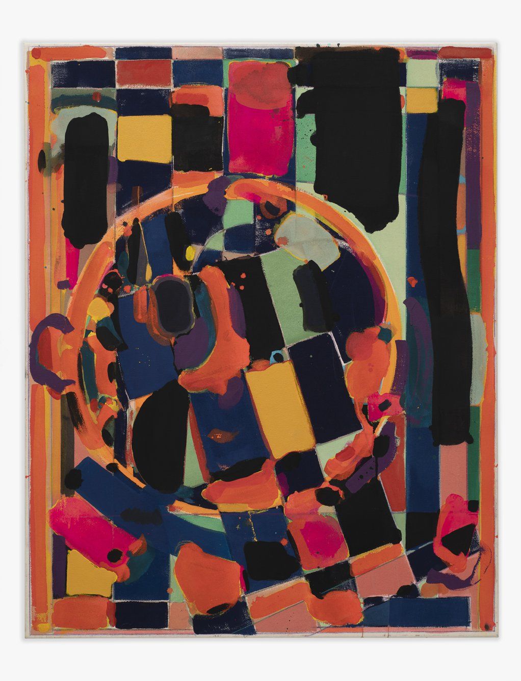
Matt Connors,
Deglove,
2021,
45 × 36 in (114.3 × 91.44 cm)
Acrylic, oil, and colored pencil on canvas
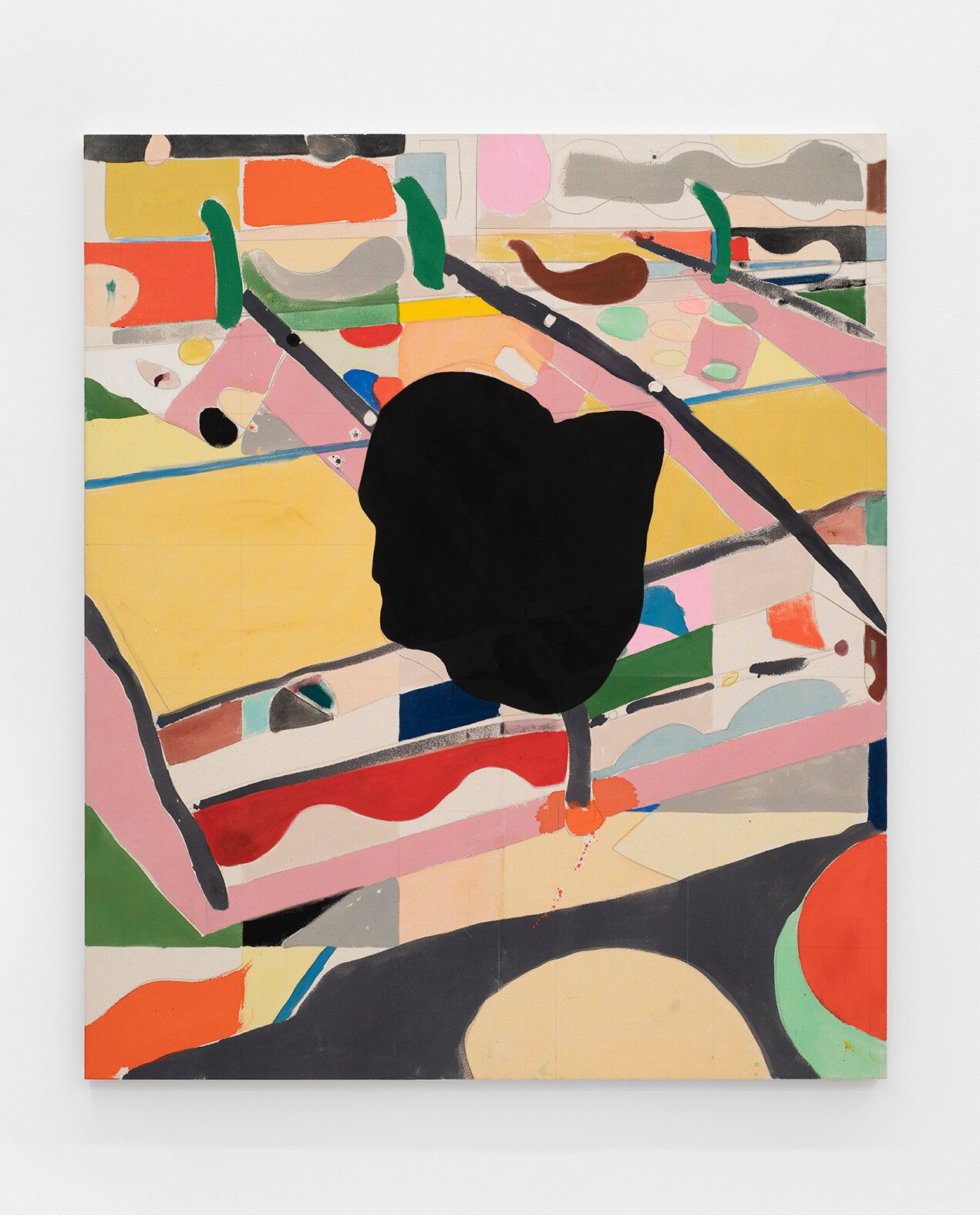
Matt Connors,
Data & Recognition ,
2022,
60 × 51 in (152.4 × 129.54 cm)
Acrylic and pencil on canvas

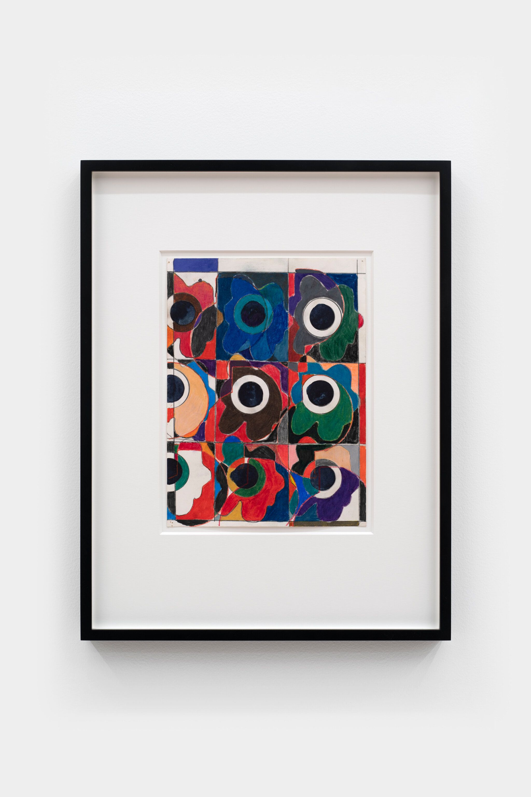
Matt Connors,
Untitled ,
2022,
22 × 17 in (55.88 × 43.18 cm) (Framed)
Colored pencil on paper
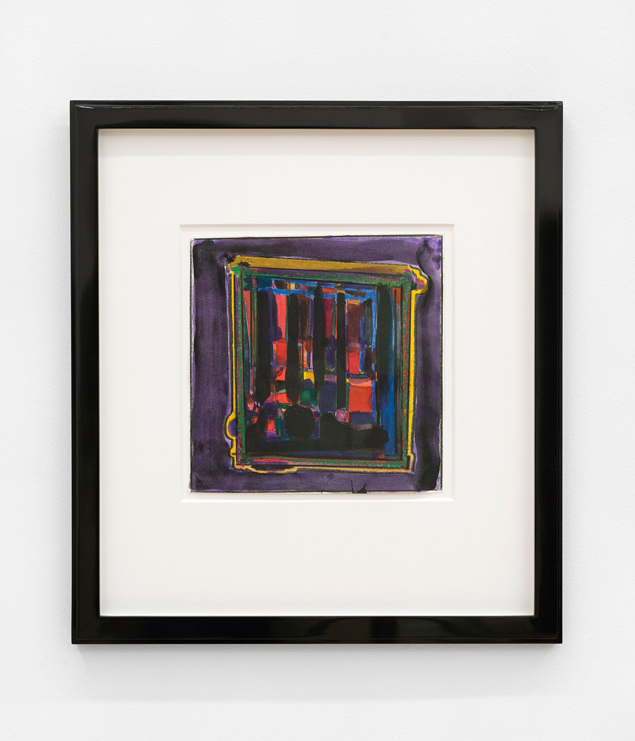
Untitled,
2021,
9 ¼ × 9 ¼ in (23.495 × 23.495 cm)
Watercolor, acrylic, and colored pencil on paper
Matt Connors,
Bugchaser II,
2022,
12 ¼ × 9 in (31.115 × 22.86 cm)
Colored pencil and watercolor on paper
Press Release
Canada is excited to announce Body Forth and A Cliff to Climb, two solo exhibitions by Matt Connors and Ryan Preciado. In conjunction with the exhibitions, a book by Matt and Ryan will be published by Pre-Echo Press and Canada with the following text by Durga Chew-Bose.
Catching Up
Choosing the right color for the trim on his studio windows had put Matt in a state of complete agony. The studio, which was a former woodshop on 10th street in the East Village, needed more light, so he opted for factory style windows, inspired by the clerestory ones at Dia Beacon. Up close, the glass pattern of small squares gives the impression of graph paper; Quadra, I believe, it’s called. In this way Matt’s studio windows oblige whatever sense of privacy one is seeking while still specifying the day. A blue sky is obscured, yet still blue, and come winter, an overcast morning remains indefinite: the way grey can feel impossibly bright when diffused. When the manufacturer called inquiring as to the trim, Matt finally arrived at yellow—the most legible, almost incipient and unexamined shade of yellow. Like something you might encounter in a public school or at the hardware store. An original yellow like the first Post-it note.
Because titles come last, he tells me, Matt has yet to name a piece he’s working on which uses the same yellow: a rectangle, functioning much like his window trim, as if designating the painting’s insides from its outsides. It’s an attractive work, flush for the most part with a congenial, ruddy palette, and smeared (here and there) with black and dark green (bringing to mind pimento olives, if you’re in the mood). The canvas’ economy of blots feel familiar yet unsettled, and even a little domestic, like a Lydia Davis short story. Or the flawed beauty of travertine. Or Gena Rowlands as Minnie Moore.
Minnie Moore’s Los Angeles is pink. Or maybe black. Depends on how you remember the movie. (Depends on which pair of sunglasses commemorate her character.) But Minnie Moore’s Los Angeles is also pale blue, if you’re thinking about her bathrobe. Yellow if you’re misremembering which Gena Rowlands role in which Cassavetes film. Red if the memory of Minnie’s barrettes becomes clear; brown if you’re thinking about the scene in the Palomino parking lot where she borrows Seymour’s jacket. Cassavetes knew what he was doing when he made a movie about two blondes who become totally defenseless to each other because nobody really remembers Minnie and Moskowitz as a story about two blondes—instead they see pink or think hard about a handlebar mustache, or look back on the loneliest man there ever was. His name was Zelmo Swift.
The Los Angeles in Minnie and Moskowitz is nothing like the Los Angeles Ryan observes, except when it is. Seymour Moskowitz parks cars for a living. His free spirit is well-suited for a job so stopgap in nature. Later in the movie, he confesses his crazed, totally bananas love for Minnie while they sit in his blue-grey 1956 Ford F-20 Custom Cab. It’s a good scene, the kind that demands the confessional intimacy of a car in order to witness the completely electric, dumb-happy risk of declaring big feelings to someone you barely know, whom you have nothing in common with. Minnie shoots him down and climbs out. They go back and forth like this for a bit because cars coerce this sort of fighting, especially in Los Angeles where nobody gets far on foot.
“I like moving, not being stuck in one place,” Ryan tells me. He spends most of his time on the Eastside, where he was born, though he grew up in Nipomo. Ryan describes his sculptures and furniture designs as “drawing with wood and metal.” He tells me about a recent piece, co-authored you might say, with car sensibilities. It’s a cabinet he designed at his friend José’s autobody shop in Boyle Heights. It’s an active shop and the cabinet is evidence of that variety of “chaos” Ryan says. “José constantly had cars coming in and out which meant I had to move around twenty times or so. I was chasing that high-gloss finish and still, there are imperfections. There’s something about that I like though.” As Ryan is describing the cabinet to me over the phone, he witnesses an accident. “A guy just crunched his car,” he tells me. “He hit a telephone pole and left.” I ask if the guy seems okay and Ryan says yes. A minute or so later, Ryan sees the driver again. He’s pulled over on the side of the street, examining his car, a little bewildered as to what just occurred. I’m picturing the driver’s state of surprise, as observed by Ryan and recounted to me, nearly three thousand miles away.
Ryan considers himself a deeply curious person. “Part of what I do is just stare at things, not even questioning why. I take photos of, like, the grip of a hammer, everyday objects, you know? It’s exciting when a bent trashcan turns into an idea.” I wonder if the pole that “crunched” the car will provide a point of entry for Ryan and I start imagining what kind of idea might pass into being and become his next design. Mostly, though, I’m just thinking about the word crunched, how it sounds regional—faithful to a place where cars rule. Slam, I figure, simply wouldn’t suit. Not on Ryan’s coast anyways.
In no particular order, here are other things that inspire Ryan: lowriders; misremembered lyrics; his Chumash heritage; the Pope’s mitre (which Ryan says gave way to one of his keyhole-shaped cabinet designs); the guys and their trucks in Huntington Park who Ryan loves to watch “tie things down;” chicken feet; caution tape made to look like birthday ribbon on broken glass; murals of the Virgin of Guadalupe; a photograph from his childhood of Ryan and his mother rollerblading at an indoor rink. She’s smiling with her arms wide open. You can see Ryan in a yellow jersey not far behind her, catching up. The photograph is joyful, approximating infinity. Ryan, it turns out, has sketched a shelf born of that same ecstasy. I soon learn that Ryan’s family often enters the picture.
“I like the idea of teenage furniture,” he says. I ask Ryan what he means. He recounts a story about his younger sister: “She had a friend over, and they were hanging out. They were sitting on the couch just trying to get comfortable, and they kept sitting differently.” Ryan doesn’t explain further. He doesn’t have to. The bright yet sleepy quality of his designs—his affinity for corduroy, cane, curved lines—calls upon the kid who grew up hanging out in skate shops or 7-Eleven parking lots. There’s a sense of inherent ease; ease that springs from effort, like skating. There’s an affection, too, for color or the heavy, true-blue character of Douglas fir. Somehow, Ryan’s furniture designs approximate two simultaneous states: the original sketch and the final thing. Like seeing an idea come to life but also in reverse. His work is familiar, the way dreams are familiar even if their textures feel notional. Perhaps what’s at play is the exaggerated plainness of Ryan’s designs—how the bowed lines of his Nipomo sofa, for instance, appear neighborly. It seems obvious, but why shouldn’t more furniture feel neighborly?
Screwed to the wall in Matt’s studio is a single yellow hook. A gift from Matt’s friend Jordan. It’s shaped like a tongue or the letter “J.” Reflecting on it, I text Matt: hooks are terrific presents, aren’t they? Whenever Matt uses it, he’ll think of Jordan. Like on a rainy day when Matt hangs up his wet umbrella. Or come February, when Matt reaches for his sweater. Jordan’s gift belongs to the same attentive thinking I associate to Ryan’s designs, where hospitable function can seem all at once phenomenal and nothing-to-it. Similar to Matt’s process—which he describes as “fast and free”—the hook doesn’t announce its purpose. A hook is…just there. Convenient. It solves a problem you didn’t know you had. It experiences many lives: the umbrella, the sweater, a friend who visits the studio (their sweater). Sculpturally, the hook is always the same and always new. Sonically, the hook is shaped like the words “you’re welcome.” A smooth and melting sound. Next time a friend moves apartments, I decide I’ll get them a new hook, or a doorknob to screw in, replacing an old one.
Matt Connors (b. 1973, Chicago) lives and works in New York and Los Angeles. Institutional exhibitions include: Whitney Biennial (2022), Le Consortium, Dijon (2018); Kunstmuseum Bonn (2015); MoMA, New York (2014) Walker Art Center, Minneapolis (2013); MoMA PS1, New York (2012), Kunsthalle Düsseldorf, Germany (2011). In 2015, Matt Connors was a resident at the Chinati Foundation, Marfa, Texas. In 2012, he published the award-winning book A Bell is a Cup. His latest book, Gui(l)de, was published by Karma in 2019.
Ryan Preciado (b. 1989) lives and works in Los Angeles. A furniture designer trained in carpentry, Preciado has used wood in one way or another for the last twelve years. His work is inspired by his family history of Chumash, Native American and Mexican heritage. Fueled by an ongoing relationship to the violence of assimilation in the United States, Preciado curated “Downhearted Duckling" at the South Willard Gallery in Los Angeles featuring Diana Yesenia Alvarado, Mario Ayala, Rafa Esparza, Magdalena Suarez Frimkess, and Alfonso Gonzalez Jr. A Cliff to Climb is Preciado’s first gallery exhibition.